A2 DEADLINES

A2 DEADLINES

Research and Planning/Hand in Folder: November 4th

Finished Music Video: December 16th

Finished Website/CD Cover/Evaluation/Blog:13th January

Thursday 25 November 2010

things that went wrong :(


after spending a day filming we came to upload all our clips and started to edit when we found the clips were heavily pixilated and very dark. This could of effected our grade therefore we decided to do the filming again. Luckily we had start to film early and had more time to re-film although it took a verrryyyyy long time it was worth it in the end. 

inspiration and ideas


after filming the first time we thought it went well however when uploading our work we got the lighting wrong and our footage wasn't as good as we had wanted, therefore we now have to reshoot however this has been an advantage as now we know where we went wrong, what was good whilst we were shooting and what we can do differently now we are doing it again.

now we are doing it again we have now got new inspiration and different ideas to bring in to our video to make it more original and different to our original idea..

we like the video above however we would only use this as a shorter clip maybe for lyric
"so we conducted a plan.. "
on paper then speed it up whilst editing to get tis effect :)

Thursday 4 November 2010

video research :)


kickstart - example 
we got alot of inspiration from this video as we really enjoyed the split screen showed in this video and felt if looked really good and effective therefore we want to use this idea in our own video :)


kate nash - pumkin soup 
we loved this video because of its originality and quirkyness as we felt it reflects kate nash's character very well.
we were influenced this through the use of its bright colours making it interesting also the use of costume and props!


kate nash - mouthwash
we really enjoyed how she started in the mirror looking at herself and starting the song knowing its from her point of view :) we thought this was an effective opening and drew you in straight away to carry on watching, 


kesha - your love is my drug 
although this artist doesnt catorgarise into the indie -pop genre we really liked some techniques she used in her video.
in this image you can see a cartoon heart between the two characters, we really liked this and intent to use cartoon images in our video and it takes away the naturalistic feel and adds to the quirky fun feel we are aiming for. 


ideas board :)


here is a selection of pictures put together which have generated ideas for us :)
things include costume, location, props and patterns :)

pitch powerpoint :)


here is our printed out version of our pitch :)
we gave starter lines and initial idea's on each slide then developed them through speech.
this was a really helpful  exercise as we had to know every detail about our video in order to explain it in order that our audience understood our ideas :)
it also helped when we got gave feedback from our audience mentioning our strengths and weaknesses to help point out what we need to work on :)

website design :)


here is our draft website design :)
after carrying out website research we decided we wanted to go with a simple layout where you can click on a page to open a new tab so it is easy to understand, we want to include lots of different colours to portray her style and genre right.
also we wanted to include suitable images for example to swallow which is cute and iconic for Kate Nash as her previous websites inlude numerous swallows. 
the butterflys and bumble bee will be drawn on to keep it not naturalistic yet cute and simple :)

digi pack design :D


on the cover we want 'Kate Nash' on the swing which we have already mentioned then on the back cover the same photo in reverse from the back of her as we feel this is simple yet effective :) 
on the inside sleeve we want a picture of a daisy with writing i love you, i love you not which is suituable and links with the lyrics.
finally on the cd we just want kate nash in our selected font on a vintage pattern background to keep to our vintage indie pop genre :) 

cd cover :)


here is a picture of one of our friends we took :)
we thought it was a good idea and maybe the style could be used in our cd cover how its pretty and cute suitable for our female artist and her cute style.
the flowers bring out colour and we can chose the costume according to the colour of flowers to create a link and make it look affective.
it keeps to the quirky style and the happy vibe the song creates.


at one of our locations of ria's house there is a tree swing therefore we want to put our main character on the swing smiling and swaying. We could put an antique affect onto the image to keep the vintage style and keep to the indie conventions yet have her smiling and looking up giving the impression she's thinking about the boy her 'love' that she aims to get in the video we will also use the font in the previous research to add onto the cover 

Location

in the video a line of the lyrics includes 'and she did some really nasty stuff down in the park with michael' so therefore a short clip and a minor location is the park. We want to show the girl walking with the named character 'michael' then she drags him of screen into a bush implying what she is going to do with him however without showing it, we hope this will add to the humour side of our video and relate to our target audience :)


(main location used in video) 


This is the location that we will be filming most of our music video. We had a number of locations that could have been appropriate for our video however we thought this fitted our story best. This will be the house of the main girl and some of the shots of her singing will be outside of this house. We felt that as it is a cute white cottage looking house it would suit the image of the cute love struck nerd in our story. Also as the house is white it will be a good background to use when recording as it will help for the character to show up. 

Nottingham, Hockley (1 scene will be filmed here) 

We are going to do some of the filming in Nottingham town in Hockley. We have chosen this location as its the area of Nottingham that is full off vintage shops and little boutiques and we felt that this would be an appropriate location for our character to be in as this would be the sort of area that she would hang out with friends or shop in and this is the same for the main guy who is also an indie/ vintage character. 

' cow' Nottingham (vintage shop)


'Vintage Warehouse' Nottingham (vintage shop) 


These images above are images of the inside of 'Cow' and 'vintage warehouse' these are two places in Hockley, Nottingham that you can get vintage clothes and we will be filming around these areas and possibly inside the shops too. As you can see from these pictures all of the clothes are vibrant and colourful and this gives us an insight of what we want our characters to wear when filming. 

(Birthday banner idea for party scene) 

This will be the birthday banner shown on the house when the party scenes come into the music video. The bright pastel colours match the theme and seam appropriate to use. This will help indicate to the audience the change of location and scene and identify that it has changed to a house party. 


(cluttered mirror image) 
As you can see from this photo it has been taken in a mirror and you can see the clutter and photos around the mirror. This is the mirror that we will b using in our music video and we will add more photos on there of the boy that our character is stalking and also herself on there with photos of hearts drawn around them to show that she is in love with him. This cluttered image of the mirror will also show the personality of the character and also of our artist Kate Nash. 

(Kate Nash individual image) 

This image of Kate Nash shows that as a person she doesn't care about looking perfect all the time in a perfect surrounding. Unlike artist such as Beyonce, Kate Nash doesn't prioritize her image and look over the quality of her music and we want to bring this across in our music video.  As  you can see in this image there is clutter all around and a strongbow can in the background. This image is the one that we want to portray in our location as we will have the cluttered bedroom and mirror.  This cluttered mise-en-sen is one that we  want to run throughout our music video to give that vintage look. 

ideas for fonts on our website and cd cover :)

Gabriel Serif
Elizajane
promised freedom

zaeyada


these are all possible fonts we liked for our website and digi pack design.
we explored a range of defferent fonts to see which one we liked best overall after finding that the first one we feel it was too heavy and more towards the rock genre the last 3 would be most appropriate.
We decided the last font was too posh and more for a classical genre so therefore we decided we both really liked the 2nd font eliza jane :)
after looking into her website we looked at the images and found the images looked as if they were drawn to keep it different and quirky therefor font 2 would be most appropriate and suitable to our style linking with images on the homepage. 


Kate Nash's Website :) 

this is kate nash's actual website! although the colours contrast to her bright personality the simplicity is effective. 
The pictures are in black and white almost like someone has drawn them coming away from the neat prestige photo's for example the stars almost like a child has drawn them. We really liked this as we thought it looked cute and appropriate to her target audience of girls who like the indie pop genre and quirky images like these.
The vintage tv increases her quirky individual style and instantly comes up with her latest video this is good and it gives her fans constant updates of what is new. This we could use ourselves. 
The layout is very simple and easy to understand, this is good as other websites we had seen instantly comes up with a homepage flooded with text for example Lilly Allen's although we liked the colours we had used this home page has a must better layout :)

Wednesday 3 November 2010

ideas for our own cd cover :)


vintage patterns

different

Digipack Cover Research

Everything Is Borrowed
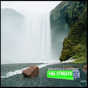
- quite unusual for the style of rap- pop genre more naturalistic feel for a classical or slow feel album
- colours are pure colours however this album has new deeper meaning songs so a new image for The Streets is coming out
- the bright green 'streets' logo and iconic image contrasts to the background pure natural image yet reflects there original image of there old songs
- we feel it doesnt have a unique selling point and aims towards Streets fans who are aware of the band already and are buying the album because they know its out and are wanting their new material

Teenage Dream
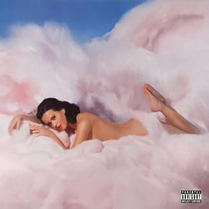
- very girl pink being the overal dominating colour appropriate for her pop genre and target audience relating to girls
- very un - naturalistic feel relating to her album songs one being 'teenage dream' less serious tone unlike the Streets. More light hearted fun feel to it.
- instantly the artist on the cover affective and appealing for her audience. Very attractive almost doing a sex appeal to get sales.
- The girly pink colours relate to her personality being fun and link to the genre of her songs.

Kings & Queens
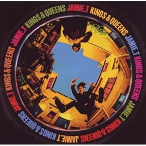
 - the colours and originality of the pack make it interesting and eye grabbing to the audience. The use of different colours make it different like Jamie T's style, he doesnt hold back and his songs and personality are bold.
- the fish eye lense makes it appealing showing Jamie T and another member almost in a mid shot having fun  creating a relaxed feel to the artist.
- sells the artist through its eye catching colours and vintage style image which relates to people who like the indie genre.
It's Not Me It's You
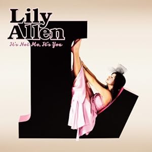
- the large L instantly represents Lily, the colours pink and black show her girly fun side being bold and outstanding.
- the simplicity is effective and makes it pretty and symbolic. 'Lilly Allen' standing out and noticible yet not being too in your face.
- the font in simple yet similar to the whole image, she appears casual on the image just herself with no shoes on with the dress being pink sticking to the colour scheme and genre of music.
- We feel this cover is more towards the girly pop genre and moves away from her music style however is still an attractive cover

 Alive Til I'm Dead Alive Til I'm Dead
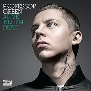
- the colours being very basic however with the album name being green is affective to the artists name professor GREEN
- serious image relates to the rap - pop genre
- the main image of him however is bold and as he is a new popular artist on the market attrracts people instantly to his album.
this is another image created on Wordle .. we selected words and key phrases we needed to include on our website from doing research into other Artists websites and put them all together to create this collage! :)

Test Shot :)

recee sheet :)

Proposal Sheet :)

Previous Video Research


Here we watched previous videos from other years and gave our opinions and marks. This really helped as we could see what looked effective and worked well in videos and what didnt look very good and needed improving. Overall it gave us ideas and things to make sure we work on when making our video.

here is a picture of our main characters car that she will be using when stalking her 'lover boy' and following him around different locations. We thought this car was perfect as it fits our genre and feel to the song perfectly, also as Kate Nash has a quirky personality and likes to include bright colours in her video's we have also adapted to this concept :)

Tuesday 2 November 2010

Costume

In our music video we want our costumes to represent our artist well. We want all of our characters in our video to be in bright or vintage clothing with similar accessories. Similarly to the costume being with this theme we want the girls bedroom to be full of lots of clutter and photographs and its and bobs stuck all around.


As you can see here in the picture Kate Nash is wearing a bright coloured vintage dress with cute black patent shoes. She has a quirky little set of DJ decks with her and a little abstract light coming down. All of these little things add to Kate Nash's over all image.

This costume and surrounding also represents Kate Nashs quirky image through costume ad set. She again is wearing bright colours with little abstract props such as posters in the background. There is also an effect n the camera to make the picture look old and antique this is an effect that we could consider using in our music video or album cover.


I found this image and thought that it represented well the image we want our characters to have. The big  print oversize jumper is a very iconic vintage thing to wear therefor we will ask around for one or look in the shops for one that our main character can wear.


These geek glasses will be worn by our lead girl to show her cute innocent but still quirky look. These glasses are seen as extremely fashionable to be wearing at the moment as many famous fashion icons wear them and therefore they will still show Kate Nash's high fashion image but still seam like the innocent character of the girl in the story. 


As you can see this is a photo off Myleene Class a well known fashion icon from from channel 4's 'ten years younger' is seen as a well dressed women who gives great fashion advice. In this photo Myleene is wearing a pair of ray bans these are a brand of glasses which tend to have a vintage and geek look which would be ideal for our artist to wear and we have a look a like version of these ready for our lead girl to wear.