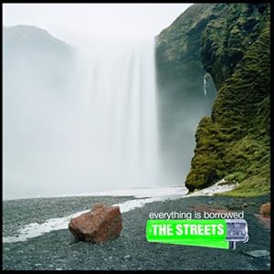
- quite unusual for the style of rap- pop genre more naturalistic feel for a classical or slow feel album
- colours are pure colours however this album has new deeper meaning songs so a new image for The Streets is coming out
- the bright green 'streets' logo and iconic image contrasts to the background pure natural image yet reflects there original image of there old songs
- we feel it doesnt have a unique selling point and aims towards Streets fans who are aware of the band already and are buying the album because they know its out and are wanting their new material

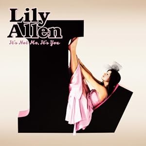
- very girl pink being the overal dominating colour appropriate for her pop genre and target audience relating to girls
- very un - naturalistic feel relating to her album songs one being 'teenage dream' less serious tone unlike the Streets. More light hearted fun feel to it.
- instantly the artist on the cover affective and appealing for her audience. Very attractive almost doing a sex appeal to get sales.
- The girly pink colours relate to her personality being fun and link to the genre of her songs.

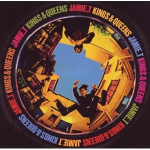
- the colours and originality of the pack make it interesting and eye grabbing to the audience. The use of different colours make it different like Jamie T's style, he doesnt hold back and his songs and personality are bold.
- the fish eye lense makes it appealing showing Jamie T and another member almost in a mid shot having fun creating a relaxed feel to the artist.
- sells the artist through its eye catching colours and vintage style image which relates to people who like the indie genre.

- the large L instantly represents Lily, the colours pink and black show her girly fun side being bold and outstanding.
- the simplicity is effective and makes it pretty and symbolic. 'Lilly Allen' standing out and noticible yet not being too in your face.
- the font in simple yet similar to the whole image, she appears casual on the image just herself with no shoes on with the dress being pink sticking to the colour scheme and genre of music.
- We feel this cover is more towards the girly pop genre and moves away from her music style however is still an attractive cover


- the colours being very basic however with the album name being green is affective to the artists name professor GREEN
- serious image relates to the rap - pop genre
- the main image of him however is bold and as he is a new popular artist on the market attrracts people instantly to his album.
No comments:
Post a Comment